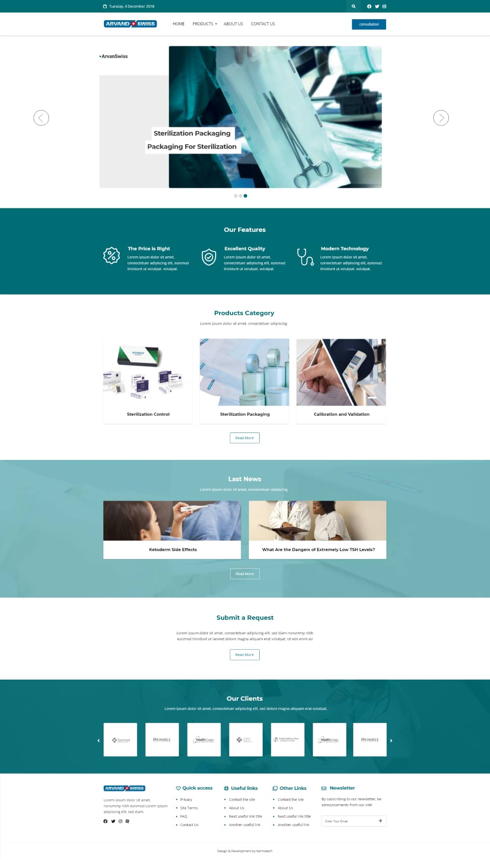
The most important goal of the site was simplicity and minimal design. In addition to transferring health feelings to customers, we needed to give simplicity to the site. Arvand customers in Europe likes a type of website simplicity that may not be the case in other parts of the world. So we needed to go for simplicity and best user experience in the site.

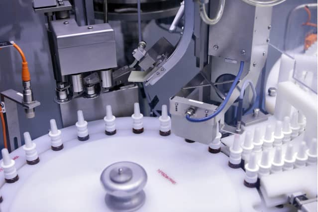
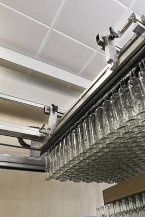
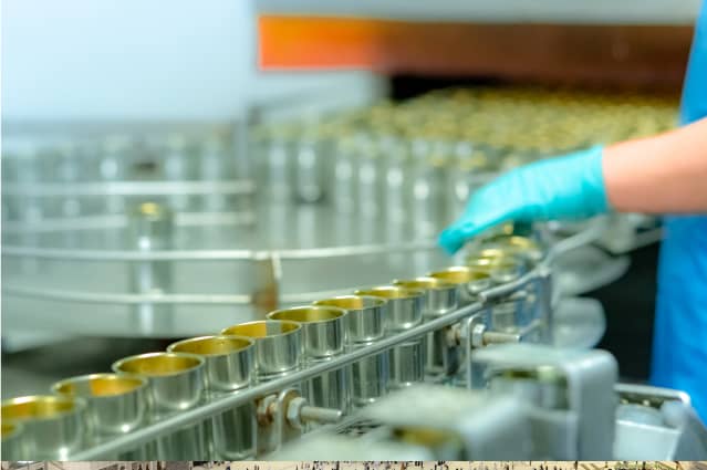
Arvand swiss is a leading manufacturer of infection prevention products our aim is to provide high level of professional sale services and support that adds value and relevance to your staff and needs; we will deliver ongoing valued consultancy to prepare for the future growth of health care field. Arvand Swiss is a customer centered company who provide professional, friendly and individual service to every customer focusing on their needs.
The Challenge
THE SOLUTION
Simplicity means different things from Europe to America and even Asia. It means simple fonts and similar colors in Europe. In order to design and transfer health vibes, we used simple and similar colors like green and blue. These colors give the feeling of calmness and health in color psychology. We did not use the gradient colors as well to have a minimal site according to European users.
We also designed appropriate user flow to give quick and clear access to services in the site. Accessing to products quickly and observing the details clearly was important to Arvand. We used collections in the middle section of the site to have grouped products so that customers can easily find their desired product. We also did different user experience testing on internal pages to come up with the best user experience. For instances, putting Ajax search in product list and navigation and breadcrumb to help user have fast observation of the site.
MATERIAL DESIGN
Color pallet
MAIN COLORS #006798
#006C74
#D9D9D9
#000000
Typography
TYPEFACES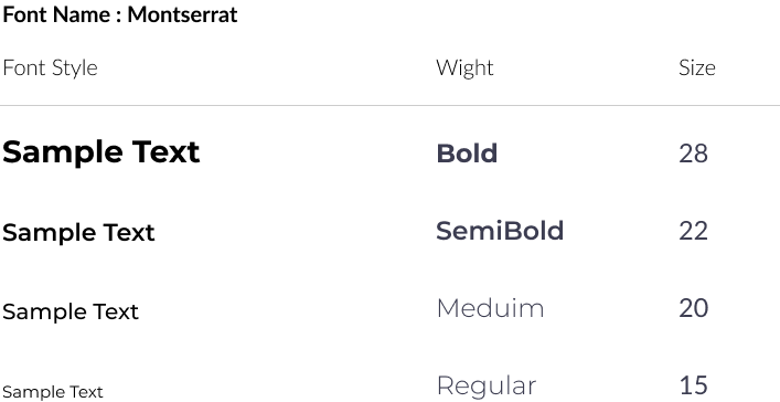
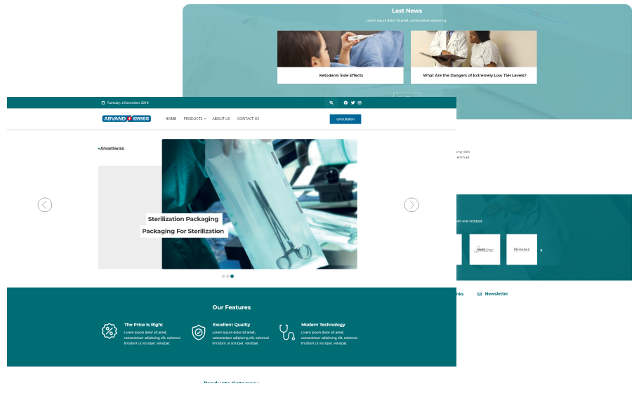
Desktop Landing
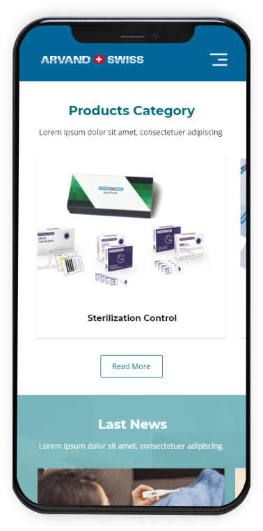
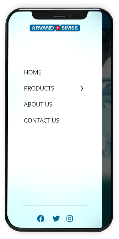
Mobile Landing