The main objective was to design the website regarding the industrial work of Magnifax company. We also needed to focus on industry related part of the business beside having a pleasant design. Taking care of industrial nature of the business beside having a simple and beautiful design was challenging, but we overcame it by mixing colors and developing appropriate sections.
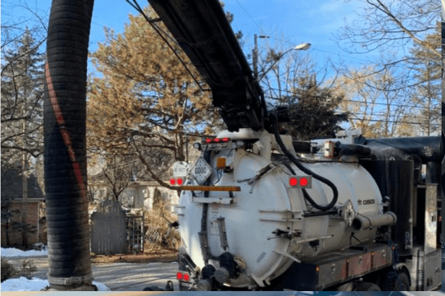
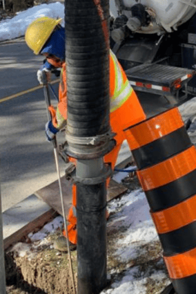
Magnifax started business in 1992 as a distributor of industrial & hydraulic hose and fittings. In 2014, set up a branch and enhanced supply chain in Toronto, Ontario to better serve our North American customers offering our branding PARAGON. As part of our commitment, we invest in and aim to provide durable hydraulic & industrial hoses from the world’s most trusted vendors to our customers in Canada and the United States.
The Challenge
THE SOLUTION
We needed to conduct several meeting with Magnifox company to get better understandings of their business. Eventually, we were able to describe the services and products of the company and have cohesive view of the business. In next step, we did needs assessment of the website users which helped us do an excellent job of user flow and wire framing. Brand identity of Magnifox consisted of black, white and red colors. In order to create contrast among these colors, we introduced neutral colors like gray.
It is known that industry related businesses cannot be shown with curve edges, so we designed the logo and all sections with sharp edges. Eventually, we were able to design with dark theme and sharp lines.
User flow which was already designed came to help, and the main goal in user flow was showcasing the products and services of Magnifax. Using appropriate navigation and the products collection ordering were the solution to customer’s needs.

MATERIAL DESIGN
Color pallet
MAIN COLORS #1071ED
#FF0303
#FFFFFF
#0A0A0A
Typography
TYPEFACES
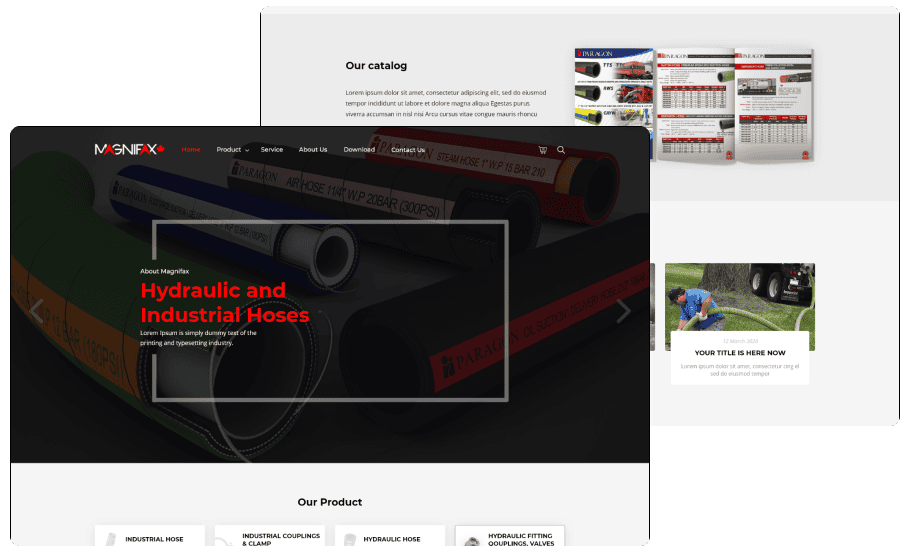
Desktop Landing
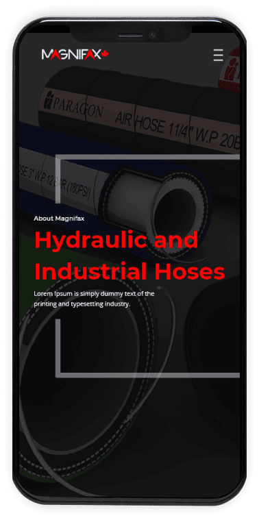
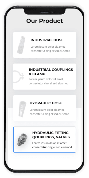
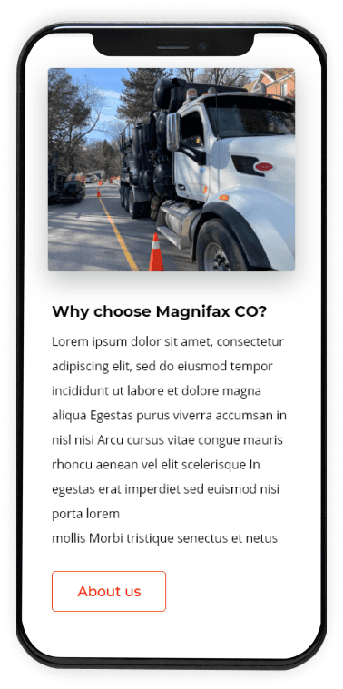
Mobile Landing