Raika33 has been providing computer physical products and network equipment to experts for a decade. It needed an online store with main goal of selling flash memory, hard disk and notebook. We only had this much data from the customer and our main challenge was to pursue specific goal in implementing the website.
Raika collection of stores begun its work on selling and configuring network equipment, security and supervisory systems and computer hardware parts in 2010. Raika online store is up for selling computer hardware parts, flash memory and network equipment. This online store is providing services in many countries in the Middle East and has its own exclusive shipping system.
The Challenge
THE SOLUTION
We started our work with getting more data from the customer. We were able to identify specific goals of customers for going online through numerous meetings. We could prioritize our goals with the help of marketing team and went on to design and implement the website.
We first did the wire framing to better understand the process. We changed the traditional processes to new ones and then optimized them with the help of marketing team. It was crucial to us that customers seeing the main products should not go through traditional ways, but compare and buy clearly and quickly.
Eventually, we went on to do user experience after defining processes and services. Brand identity book of Raika used red color in most of its stores. Red indicates danger and courage in color psychology. We tried to use red color with at most care to transfer courage sense to customers.
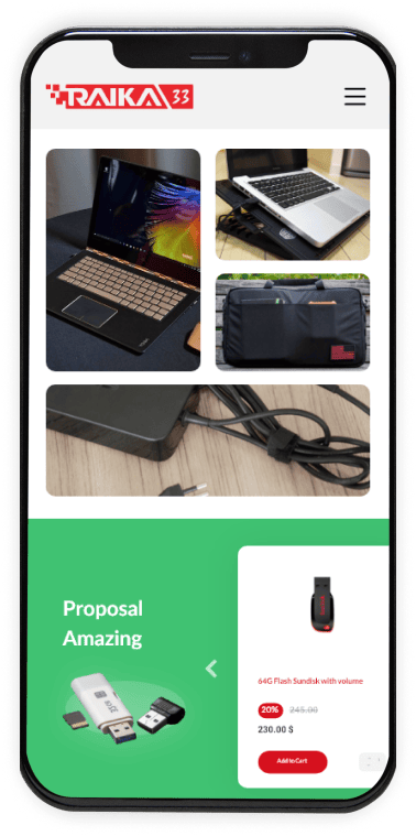
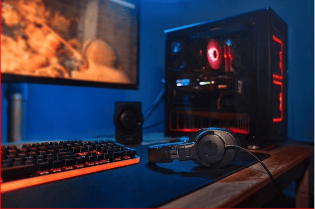
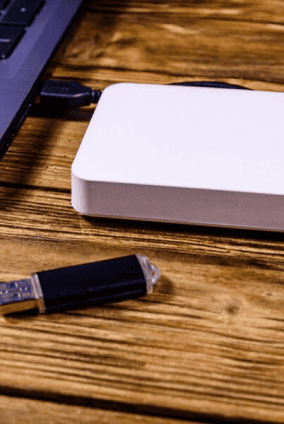
We tried to maintain the simplicity of work in Raika design and produce pleasant pictures for it. We did the photography of the products to have standard and quality photos.
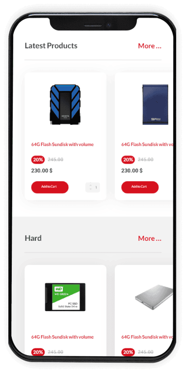
We built a section for discounts to customers with the help of marketing team using red and green colors. Using more of green color than red to transfer the sense of a good deal, and taking red from the brand identity to create sense of urgency.
Since red color indicates sense of courage, we wanted not to overuse it in our design. That’s why we rounded the edges to create the balance.

MATERIAL DESIGN
Color pallet
MAIN COLORS #40C272
#D6111E
#FFFFFF
#0A0A0A
Typography
TYPEFACES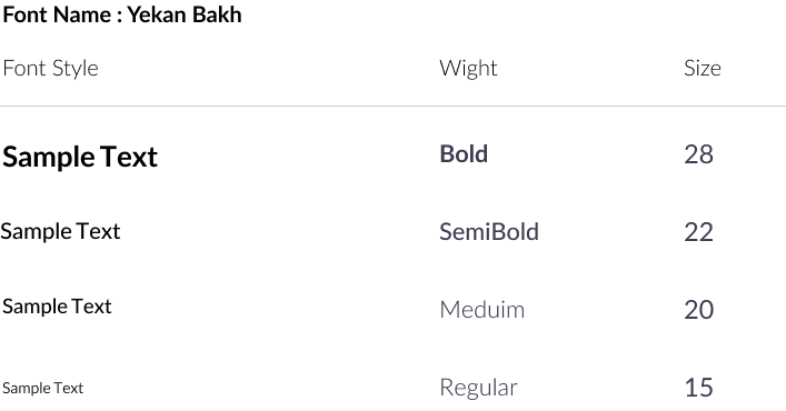
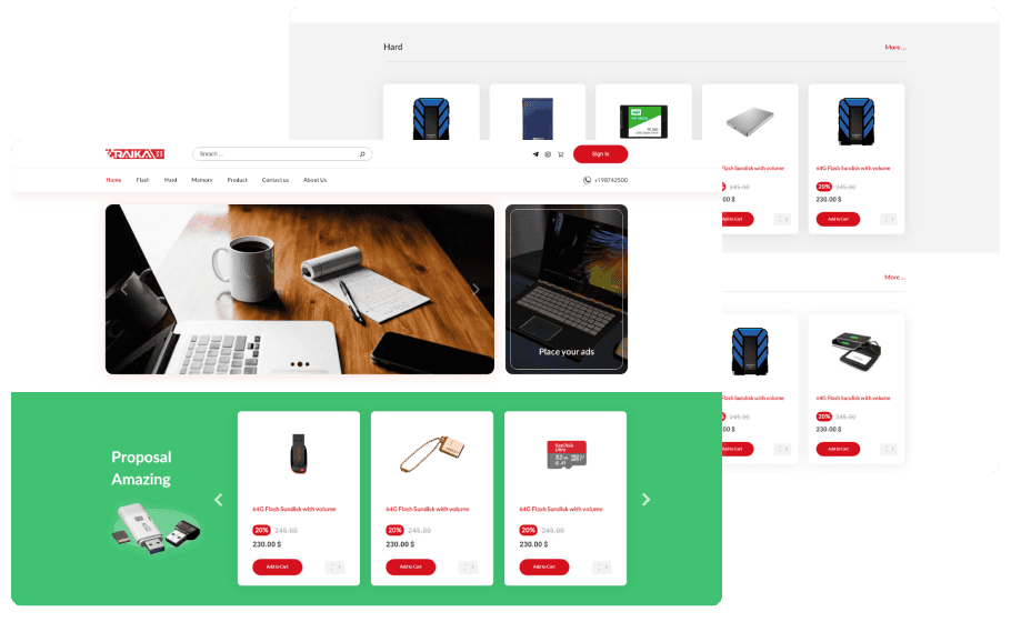
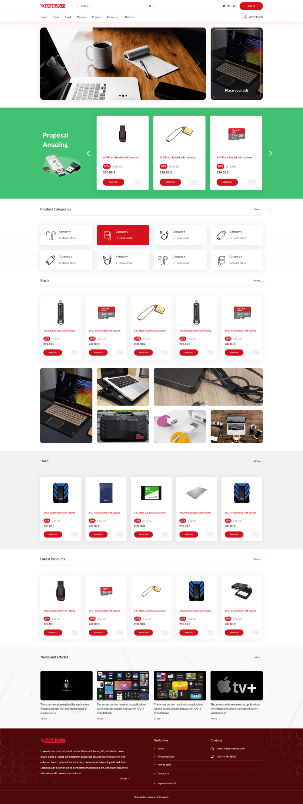
Desktop Landing
Mobile Landing